Phenotypic Profiling
import os
import numpy as np
import matplotlib.pyplot as plt
import pandas as pd
import seaborn.apionly as sns
from src.vis_utils import FeaturePlotter
from IPython.display import Image, set_matplotlib_formats
set_matplotlib_formats('pdf', 'svg')
In Ljosa et al. (2013), five approaches to cell population profiling are compared in predicting the mechanism of action (MOA) of known samples. Each approach took a matrix of several hundred extracted features for each cell over each drug treatment in an assay and condensed it in some way (such as by taking the mean, the decision boundary norm of a linear SVM, etc.) and compared it to the same characterisation of a set of annotated profiles. A prediction of MOA was made for the unlabelled profile using the nearest neighbour (1-NN) under the cosine distance, $d(u, v ) = 1 - \cos\theta_{u, v}$. We aim at using classification results in order to build biologically meaningful profiles. The strategy is thus to classify each cell into one out of several meaningful biological classes and to represent each drug perturbation by the percentages of cells in each of the phenotypic categories. This would allow us then to predict the MOA from this profile vector.
Phenotypic profiles are not only informative about drug perturbations, but also about cell lines themselves. Indeed, a cancer cell line is supposed to have acquired several properties that make them different from normal cells. Depending on the markers used, such differences can be measured by imaging approaches. We therefore hypothesised that it can be interesting to identify the phenotypic profiles of the 12 cancer cell lines from the morphological screen, corresponding to different molecular subtypes of TNBC in order to understand to what extent the molecular subtypes coincide with phenotypic differences. This would allow us to infer the biological processes which are perturbed in these different cell lines. Moreover, we will compare the phenotypic profiles from the TNBC cell lines with an existing genome-wide RNAi screen Mitocheck. RNAi is a process by which genes can be prevented from being expressed by degradation of the corresponding mRNA. This is also known as “gene silencing”. A genome-wide RNAi screen contains the phenotypic responses to silencing each individual gene in the genome. Our hope is that if we can compare the cell lines at the phenotypic level with a genome-wide RNAi screen, we can check which gene silencing experiments lead to similar phenotypes as the wild-type experiments. We can then combine this information with gene expression profiles for the cell lines in order to give higher priority to those candidates that are both downregulated in the cell lines (as compared to normal cell lines) and whose phenotype in RNAi data is consistent with the cell line phenotype we observe. This strategy is illustrated in below.
Image('img/profile_flowchart.png')

We denote our phenotypic profile as $\mathbf{p} \in \mathbb{R}^K$ for $K$ phenotype classes. Observe that the manually defined phenotype ontology acts as a latent variable behind the distribution of features. When it comes to the straightforward approach of phenotype characterisation in Adams et al. (2004), the phenotype profile $\mathbf{p}' \in \mathbb{R}^D$ for $D$ features is given as $\mathbf{p}' = \frac{1}{N}\sum_{n=1}^{N}\mathbf{x}_n$ for the $N$ observations in the data set. Yet, under the hypothesis of a latent phenotype variable, $$\mathbf{p}' \to \sum_{k=1}^Kp_k\mathbf{f}_k$$ as $N \to \infty$, where the $p_k$ are the proportions of each of the $K$ phenotypes as measured by our approach, and the $\mathbf{f}_k$ are the average feature vector for each phenotype--the archetypal phenotypes, as it were. As such, $\mathbf{p}' \to \mathbf{F}\mathbf{p}$ as $N \to \infty$, with $\mathbf{F} \in \mathbb{R}^{D \times K}$ the matrix of $\mathbf{f}_k$. Thus, the Adams profile is approximately equivalent to our own projected into a high dimensional linear space. It therefore seems unlikely that cosine distances calculated by the former approach will be as meaningful as with our own.
base_folder = '/Users/jcboyd/Documents/12CellLines-morphology/'
plate = '12CellLines-morphology'
ch5_folder = os.path.join(base_folder, 'cecog_out/%s/hdf5/' % plate)
Cell cycle phase |
Description |
|
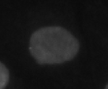 |
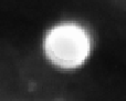
Interphase | Longest phase, cell nucleus is typically small and convex |
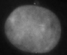 |
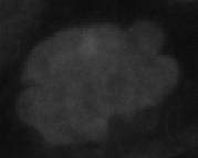
Large interphase | Large interphase nucleus, possible replication defect |
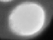 |
Bright interphase | DAPI at higher intensity, due to cell cycle deregulation |
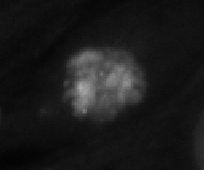 |
Prometaphase | Mitotic phase, prior to division (short $\implies$ infrequent) |
 |
Metaphase | Chromosome alignment |
 |
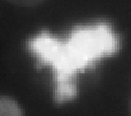
Polylobed | Abnormal shape--mitosis abberation |
 |
Apoptosis | Cell death |
cell_lines = ['MDAMB231', 'MCF10A', 'Hs578T', 'MDAMB157', 'HCC1143', 'HCC38',
              'MDAMB468', 'HCC1937', 'MDAMB436', 'BT20', 'BT549', 'HCC70']

classes = [
    'Normal Interphase',
    'Large',
    'Prometaphase',
    'Metaphase',
    'Apoptosis',
    'Polylobed',
    'Bright Interphase']
from src.phenotype_profiling import PhenotypeProfiler

pp = PhenotypeProfiler(ch5_folder, classes, cell_lines)
pp.read_classifications(plate)
Profile Visualisation
"""
Aggregate over well fields
"""
pp.group_fields()
fp = FeaturePlotter()
fig, ax = plt.subplots(figsize=(8, 3))
img = fp.plot_cell_profiles(ax, pp.df_morph[classes].as_matrix().T, cell_lines, classes,
                            title='Class frequencies by cell line',
                            cmap='viridis', normalise=True)
plt.colorbar(img, orientation='vertical', fraction=0.05, pad=0.05)
plt.show(fig)
Note the negative control, MCF10A (non-cancerous cell line)
df_norm = pp.df_morph.copy()

"""
Normalise by subtracting negative control
"""
df_norm[classes] = df_norm[classes].div(df_norm[classes].sum(axis=1), axis=0)
mcf10a_mean = df_norm[df_norm['Cell Line'] == 'MCF10A'][classes].mean(axis=0)
df_norm[classes] = df_norm[classes].subtract(mcf10a_mean)

"""
Combine columns
"""
df_norm['Interphase'] = df_norm['Normal Interphase'] + df_norm['Bright Interphase']
df_norm['Mitosis'] = df_norm['Prometaphase'] + df_norm['Metaphase']
df_norm = df_norm.drop(
    ['Metaphase', 'Prometaphase', 'Normal Interphase', 'Bright Interphase'], axis=1)

"""
Take median of counts from wells
"""
df_medians = df_norm.groupby(by='Cell Line', as_index=False).median()
Here we normalise similarly to MitoCheck (Neumann et al., 2010): subtracting the negative control, and take median of the 8 replicates. We combine columns to make them comparable to the MitoCheck data.
Mitocheck Comparison
mitocheck_classes = [
    'Interphase',
    'Mitosis',
    'Large',
    'Polylobed',
    'Apoptosis']
"""
Import MitoCheck data
"""
mitocheck_path = 'data/sirna_scores_export.txt'
df_mitocheck = pd.DataFrame.from_csv(mitocheck_path, sep='\t', index_col=None)
df_mitocheck = df_mitocheck[['ensembl gene'] + mitocheck_classes]
df_mitocheck.head(10)
"""
Find top k for each cell line
"""
k = 10
df_pred = pp.predict_top_k(df_medians, df_mitocheck, mitocheck_classes, k)
"""
Display top K results
"""
df_pred[['Cell Line', 'ensembl gene', 'Distance'] + mitocheck_classes].head()
Gene expression data
expression_cell_lines = {
    'MDAMB231' : 'MDA-MB-231', 'MCF10A' : 'MCF-10A', 'Hs578T' : 'Hs-578T',
    'MDAMB157' : 'MDA-MB-157', 'HCC1143' : 'HCC-1143', 'HCC38' : 'HCC-38',
    'MDAMB468' : 'MDA-MB-468', 'HCC1937' : 'HCC-1937', 'MDAMB436' : 'MDA-MB-436',
    'BT20' : 'BT-20', 'BT549' : 'BT-549', 'HCC70' : 'HCC-70'}
headers = expression_cell_lines.values()
df_exp = pd.read_csv('data/GeneExpressionInBreastCancerCellLines_101213.csv', sep=';')
df_exp.head()[headers]
"""
Normalise data
"""
df_exp[headers] = df_exp[headers].subtract(df_exp['MCF-10A'], axis=0).divide(df_exp['MCF-10A'], axis=0)
df_exp[headers] = abs(df_exp[headers])
plot_data = {}
k = len(df_mitocheck)
df_pred = pp.predict_top_k(df_medians, df_mitocheck, mitocheck_classes, k)

for cell_line in cell_lines:
    preds = df_pred[df_pred['Cell Line'] == cell_line]['ensembl gene'].get_values()
    exp_cell_line = expression_cell_lines[cell_line]
    exp_ranked = df_exp.sort_values(exp_cell_line)['EnsEMBL ID'].get_values()
    plot_data[cell_line] = pp.get_plot_data(preds, exp_ranked)
def multi_plot(vals, ax):
    for i, cell_line in enumerate(vals.keys()):
        ax.plot(vals[cell_line]['x'], vals[cell_line]['y'], color='blue', lw=1)

    ax.set_title('Predictions until non-zero overlap')
    ax.set_xscale('log')
    ax.set_yscale('log')
    ax.set_xlabel('top k predictions')
    ax.set_ylabel('top k expressions')
    ax.grid('on')
fig, ax = plt.subplots()
multi_plot(plot_data, ax)
ax.plot(*pp.get_probability_series(n=len(df_mitocheck), tol=0.1), color='red')
plt.show()
If we randomly choose $g$ gene expression candidates and $r$ RNAi candidates, from the same pool of $n$ genes, the probability of at least one overlap between g and r (resembling the birthday paradox) is given by,
$$p(\# matches \geq 1) = 1 - \frac{n - g}{n} \times \frac{n - g - 1}{n - 1} \times \cdots \times \frac{n - g - r + 1}{n - r + 1} = 1 - \prod_{i=0}^{r-1} \frac{n - g - i}{n - i}$$